Freight Lane Groups
As a data science consultant at a third-party logistics startup, I created an application that clarified an annual bidding process. The business submitted annual bids for a few thousand routes spanning hundreds of major US cities. My application identified groups of 10 - 20 routes, where routes in a group share a similar price. On my own time, I pushed the model to cluster 5,000 routes using the OPTICS clustering algorithm, and I added functionalities that enable the user to visualize the primary arteries in the logistics network.
Since we are not using real customer data, we simulate a customer by scattering 5,000 routes about 200 major US cities. Here is a sample of 200 of the routes.
As a user of the application, we draw 200 cities from a bag of the 998 largest US cities. From our bag of 200 cities, we draw 5,000 origins and 5,000 destinations to form 5,000 routes. The probability of a city being selected is proportional to its population; the largest city is twice as likely to be selected as the smallest city. Once the origin and destination cities are selected for each route, we define route endpoints in terms of x/y coordinates using a normal distribution centered at the city. We set the standard deviation to 200 km, which is the distance from Chicago to Madison WI, Grand Rapids MI, Peoria IL, or Bloomington IL.
OPTICS finds 115 clusters of routes. Most clusters have between 10 and 15 routes. OPTICS discards 4,152 (83.04%) routes as noise, because the routes are scattered too far apart. OPTICS accepts 848 (16.96%) routes as clusters, because these routes were packed closer together compared to the routes that got discarded as noise. Here is a map of the clusters.
The clusters connect to form hubs. Here are the clusters color-coded by hub.
The hubs and clusters form a network illustrated below. The application uses PageRank to determine the importance of each hub. More important hubs are represented by larger circles. Larger concentrations of routes are represented by thicker connections. Routes flow into the hubs.
Imagine stretching a yellow rubberband around all the origins in a cluster. Now imagine stretching another yellow rubberband around all the destinations in a cluster. Here are 25 clusters as represented by pairs of rubberbands. We interpret the irregular rubberband shapes as pricing zones, where routes within a rubberband-pair share a similar price.
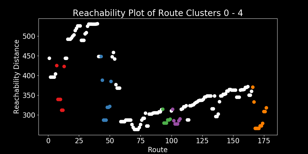
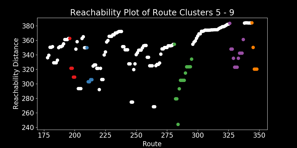
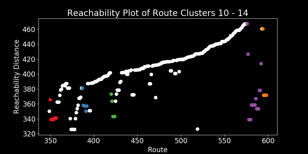
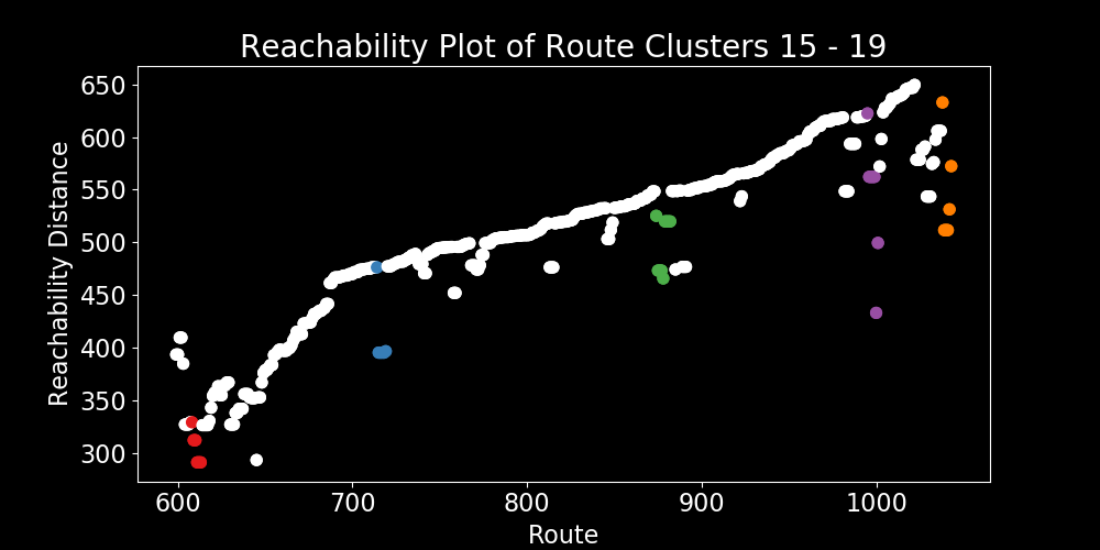
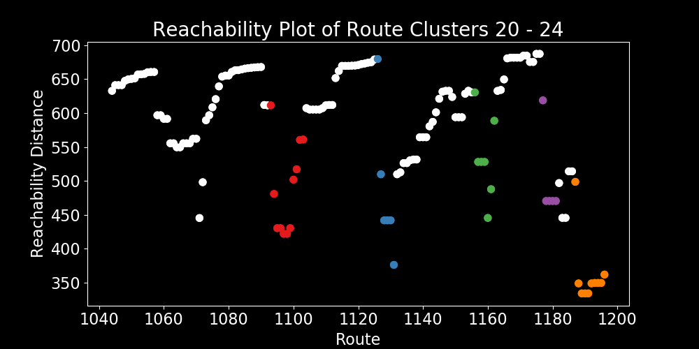
OPTICS works by hopping around the map in search of the next nearest route. If the next route is far away, then the reachability-distance is high. In contrast, if the next route is close by, then the reachability-distance is low. The dips in the graph represent areas where routes are relatively close together. Prominent dips are clusters. The clusters are color-coded in alignment with the pricing zones, above.
Feel free to visit the Python code page.